Why Pixel-Perfect Invoice Design Matters More Than You Think
Discover why invoice design is critical for client satisfaction. Learn how tiny design details like margins, alignment, and the golden ratio create professional invoices that build trust and confidence.

Sariful Islam
When clients pay for software, they’re not just buying code. They’re buying something intangible, something they can’t physically hold or touch. The first tangible thing they see, the first thing they can print out and feel in their hands, is the invoice.
That invoice is their first real impression of our work.
At Zubizi, we’ve learned this lesson the hard way. Over the years, I’ve seen developers frustrated, clients dissatisfied, and projects delayed, all because of invoice design. Not features. Not bugs. Just the layout of a piece of paper.
The thing is, invoice design isn’t just about making things look pretty. It’s about precision. Every gap, every margin, every alignment, every font size matters. When you understand this, invoice design becomes less about aesthetics and more about trust.
The Gap Between Good Enough and Perfect
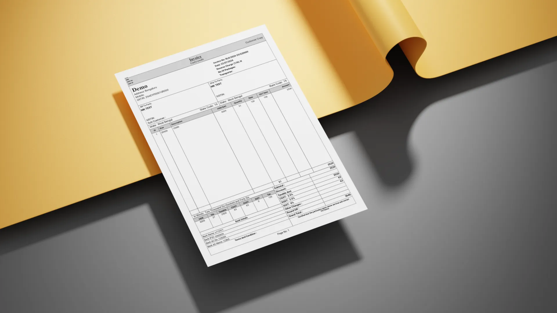
Most people think invoice design is straightforward. You put the company name at the top, list the items in a table, show the total at the bottom, and you’re done. That’s technically correct. But technically correct doesn’t mean satisfying.
I remember one client from the garment industry who kept rejecting our invoice designs. The first version we sent looked fine to us. All the information was there, properly organized. But they said it felt cluttered and unprofessional.
Our developer tried adjusting it. He moved the logo around, changed the table borders, switched up the layout. Three revisions later, the client was still unhappy. The developer was getting frustrated, not because he didn’t care, but because he couldn’t figure out what the client actually wanted.
Here’s the thing: most clients can’t articulate what bothers them about a design. They’ll say things like “it doesn’t look right” or “can we try a different layout?” But they don’t know the real problem. They just know something feels off.
That’s when I stepped in.
The Details That Make the Difference
I opened up the invoice file and immediately saw the issues. The margins weren’t consistent. The header text was slightly misaligned with the logo. The line spacing in the item table was cramped. The font sizes didn’t follow any logical hierarchy. None of these were obvious problems on their own, but together they created visual noise that made the invoice feel amateurish.
I made precise adjustments. I set the top margin to exactly match the bottom margin. I aligned every text element to a baseline grid. I increased the line height in the table so each row had breathing room. I applied proportional sizing to the headers using the golden ratio, making the company name 1.618 times larger than the subtitle.
These weren’t creative decisions. They were mathematical. Deliberate. Pixel-perfect.
I sent the updated invoice to the client. Same layout. Same information. Just cleaner spacing and alignment.
They approved it immediately.
The developer was stunned. We’d been going back and forth for days, and I fixed it in one shot. But I didn’t do anything magical. I just understood that design isn’t about big changes. It’s about tiny details executed correctly.
Why Proportions Matter
There’s a reason the golden ratio shows up in art, architecture, and nature. Our brains are wired to recognize balance and proportion. When something follows these natural ratios, it feels harmonious, even if we can’t consciously explain why.
In invoice design, I use the golden ratio to determine header sizes and line spacing. If the main heading is 24 pixels, the subheading should be around 15 pixels (24 divided by 1.618). The spacing between sections should follow similar proportions. This creates visual rhythm that guides the reader’s eye naturally from top to bottom.
When proportions are off, everything feels slightly wrong. The invoice might have all the correct information, but it won’t inspire confidence. It’ll feel like something made quickly without attention to detail. And if your invoice looks careless, what does that say about your software?
The Developer’s Frustration
Working with perfectionists isn’t easy, especially when you’re the one building what they’ve envisioned. One day, one of our developers was visibly frustrated while working on a client’s invoice. The client himself was a perfectionist, someone who noticed every tiny misalignment, every inconsistent gap.
The developer had been tweaking the invoice for hours. He’d adjust one element, send it for review, get feedback about something else, adjust again, repeat. It felt endless. The kind of tedious work that makes you question whether the details really matter that much.
I could see the frustration building. Not just with this particular task, but with the entire concept of pixel-perfect design. When you’re writing code, precision is binary. Either it works or it doesn’t. But design lives in this murky space where things can be technically correct but still not quite right.
I took over the file and started making adjustments. Small ones. I fixed the alignment issues, adjusted the gaps between sections, tightened up the spacing. Then I sent it back to the client.
They approved it in one shot.
The developer was both relieved and confused. How did that work? What did I change that he hadn’t already tried?
Teaching the Principles
After that incident, I sat down with our development team to explain the principles behind pixel-perfect design. It wasn’t about having some magical design sense. It was about understanding a few core concepts and applying them consistently.
First, consistency. Every margin should be a multiple of a base unit. If your base spacing is 8 pixels, then margins should be 8, 16, 24, or 32 pixels. Not 10, not 15, not 22. This creates visual alignment that the eye picks up subconsciously.
Second, hierarchy. Not all text is equally important. The company name matters most, so it gets the largest size. Invoice numbers and dates are secondary information, so they get smaller sizes. Item descriptions need to be readable but not dominant. When these relationships are clear, the invoice guides the reader naturally.
Third, breathing room. Dense layouts feel stressful. Information needs space to exist. Line height should be at least 1.5 times the font size. Margins around sections should be generous enough to create clear separation. White space isn’t wasted space. It’s what makes everything else comprehensible.
Once the team understood these principles, invoice design stopped being a source of friction. They could apply the same rules systematically rather than guessing what might look better.
Why Clients Can’t Explain What They Want
Here’s something I’ve noticed over the years: clients almost never describe design problems accurately. They’ll say “the layout needs to change” when really the problem is font sizing. They’ll ask to “make it look more professional” when what they mean is “the alignment is off.”
This isn’t their fault. Most people aren’t trained to see design the way designers do. They experience the end result, the feeling something gives them, but they can’t diagnose the specific elements causing that feeling.
This is why design conversations can be so frustrating. The client knows something is wrong, but they can’t tell you what. They propose solutions that don’t address the actual problem. And if you just implement what they ask for without digging deeper, you’ll end up in an endless revision loop.
The solution is to look past what they’re saying and observe what they’re reacting to. Show them mockups. Watch their body language. Notice which versions they dismiss immediately and which ones they study closely. The answer is usually in those reactions, not in their words.
The First Impression Problem
Software is intangible. You can’t hold it, you can’t see it physically, you can’t judge its quality by looking at it on a shelf. This creates a trust problem. How do clients evaluate something they can’t physically interact with?
They judge it by its outputs.
The invoice is often the first physical artifact a client sees from your software. It’s the thing they print, sign, and hand to their customers. It represents your work in the physical world. If that invoice looks sloppy or amateurish, it undermines confidence in everything else.
I explain this to clients who don’t initially understand why we’re so meticulous about invoice design. Your invoice isn’t just a document. It’s proof of quality. It’s a signal that we care about details. When their customers see a well-designed, professional invoice, they’re seeing evidence of a well-built system behind it.
This is why I tell our team that every tiny detail builds trust. A consistent margin builds trust. Perfect alignment builds trust. Proportional sizing builds trust. These aren’t just aesthetic choices. They’re business decisions.
From Frustration to Pride
The emotional cycle of fixing invoice designs has become familiar. It starts with developer frustration. The client is unhappy, feedback is vague, and changes don’t seem to help. Everyone feels stuck.
Then someone figures out the real problem. Usually it’s about spacing or alignment or proportions. The fix itself takes minutes once you know what to change.
Then the client approves it, often enthusiastically. They’re happy, not because we added anything new, but because we finally made it feel right.
That’s when frustration transforms into pride. The team realizes that those tiny details actually matter. That pixel-perfect precision isn’t perfectionism for its own sake. It’s the difference between work that’s acceptable and work that’s excellent.
This cycle has repeated enough times that our developers now approach invoice design differently. They start with the fundamentals: consistent spacing, clear hierarchy, balanced proportions. They sweat the small stuff before anyone asks them to. And more often than not, clients approve designs on the first or second try.
The Lesson in the Details
Looking back on all the invoice design challenges we’ve faced, the lesson is consistent: details create the difference between good and great.
You can build sophisticated features, write clean code, and solve complex business problems. But if the invoice your client prints looks cluttered or misaligned, that’s what they’ll remember. That’s their tangible experience of your work.
This isn’t about being obsessive. It’s about recognizing that in software development, the things users interact with most directly are often the simplest: forms, reports, printouts. These deserve the same care and attention we give to complex backend systems.
Pixel-perfect invoice design matters because quality compounds. When every element is precisely aligned, when proportions follow natural ratios, when spacing is consistent throughout, the result feels professional. It feels trustworthy. It makes clients confident they made the right choice.
And that confidence, built from tiny details like margins and font sizes and the golden ratio, is what turns one-time clients into long-term partners.