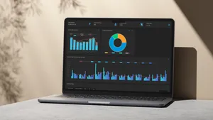
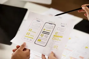
UX in Business Software: Why Intuitive Design Matters
Lessons learned from building ERP software for Indian SMEs, why usability matters more than feature lists, and how intuitive design drives adoption, trust, and business growth.

Sariful Islam

I still remember our first order that came from a departmental store that hadn’t even opened yet. They already had accounting software installed, one of those legacy systems people buy just because “everyone uses it.”
When we walked in, our own software was barely complete, half the modules were still under development, some buttons didn’t even work. But we decided to show them the demo anyway. What we did have was a clean, simple interface and a design that just made sense. You could find things without asking. You could create an invoice without needing a manual.
By the end of that demo, they didn’t ask about missing features. They said, “This feels easy.” And that was the moment I realized something every developer should tattoo on their brain:
It’s not about how many features your software has, it’s about how confidently someone can use it from day one.
That experience changed the way I thought about building business software. Because powerful doesn’t always mean complicated. Sometimes, the real magic is in how intuitive it feels, when the user just knows what to do next, without needing to be taught.
The Common Mistake: Feature Overload
In India’s B2B software market, there’s a strange obsession with feature lists. When you pitch to clients, they want to see long PowerPoint slides filled with capabilities. “Does it have multi-currency support?” “Can it handle batch tracking?” “What about barcode integration?”
And so, like many developers, we kept adding. More modules. More options. More buttons on every screen.
The problem? We were designing for the sales pitch, not for the person who’d actually use the software eight hours a day.
I’ve seen ERPs where a single screen has 47 input fields. I’ve seen billing software that requires 12 clicks to create a simple invoice. I’ve seen dashboards so cluttered with widgets that users just… ignore them entirely.
Feature overload isn’t impressive. It’s overwhelming.
The irony is that our clients didn’t ask for simpler software because they assumed complexity was the price of power. They thought business software was supposed to be difficult. That’s just how things were.
What UX Really Means in Business Software
When people hear “UX,” they often think of pretty colors, rounded corners, and smooth animations. And while those things matter, they’re not what UX is about, especially in business software.
Good UX in an ERP or billing system means one thing: Can a user complete their task quickly, confidently, and without frustration?
That’s it. It’s not about making software look like a consumer app. It’s about respect, respect for the user’s time, their mental energy, and their need to get work done without becoming a software expert.
At Zubizi, we started asking different questions during development:
- How many clicks does it take to create an invoice?
- Can a new employee figure out the production workflow without asking for help?
- If someone makes a mistake, can they easily undo it?
- Does the screen show only what’s needed right now, or everything that could be needed someday?
These questions changed everything.
The Intuitive Advantage
Let me share a specific example. When we first built our sales module, it was simple, clean, and easy to use. But over time, as we gathered feedback and new requirements, we started adding more fields, buttons, and features. Gradually, that simplicity disappeared. The module turned into one massive form where users had to enter everything at once: order details, customer information, item selection, pricing, taxes, shipping, and payment terms, all on a single screen.
Technically, it worked fine. But in reality, users kept making mistakes. They often skipped required fields, entered quantities in the wrong units, or forgot to apply discounts. That was the moment we realized that adding more features does not always mean improving the experience.
So we decided to rethink the design completely. We reorganized the sales module into focused, logical sections that made sense to the user:
- Header Information: Customer details, order date, and reference number
- Additional Information: Shipping details and other optional fields placed in a collapsible section that could be expanded when needed.
- Item Selection: A clean table for adding products, with column visibility toggles that let users customize their view based on their preferences.
- Footer Summary: Totals, taxes, and action buttons clearly separated at the bottom for quick review.
After the redesign, training time dropped from two hours to twenty minutes. Data entry errors went down by almost 60 percent. And here’s something most people overlook: our support ticket volume decreased significantly.
Why? Because when software feels intuitive, users trust their own judgment. They stop second-guessing every click. They don’t call support for simple tasks. They just get their work done.
This is the invisible ROI of good UX.
Lessons from Zubizi
Building software for small and medium garment manufacturers taught me something important: our users aren’t software professionals. They’re business owners, accountants, production managers, people who need technology to simplify their work, not complicate it.
Here are some lessons we learned the hard way:
Fewer clicks always wins. We obsessed over reducing steps. Every unnecessary click is a moment of friction, a chance for users to lose focus or make a mistake.
Navigation should be obvious. We moved from a complex multi-level menu to a simple, persistent sidebar with clear icons and labels. Users stopped asking “where do I find…” questions.
Error messages should be helpful. Instead of “Error: Invalid input in field #23,” we wrote “Please enter a valid phone number (10 digits).” Small change, massive difference.
Default values are magic. Most invoices have similar tax rates, payment terms, or shipping addresses. Pre-filling intelligent defaults saved users thousands of keystrokes every month.
White space is not wasted space. We learned to let screens breathe. Less visual clutter = better focus = faster work.
Why ‘Feels’ Matter in Business Apps
There’s a psychology to usability that we often ignore in B2B software.
When software feels natural, when buttons are where you expect them, when workflows match mental models, when the system responds immediately, something interesting happens: users develop confidence.
Confidence leads to competence. Competence leads to speed. And speed leads to satisfaction.
I’ve watched this transformation dozens of times. A skeptical accountant who initially resisted our software becomes its biggest advocate after a few weeks. Not because we added features, but because the system stopped fighting them.
Think about it: we spend more time in business software than we do in most consumer apps. If that experience is frustrating, it affects mood, productivity, and ultimately, how people feel about their jobs.
An accountant who enjoys using your billing software will do better work than one who dreads opening it.
This isn’t about making software “fun”, it’s about removing unnecessary cognitive load so users can focus on what actually matters: their business.
Balancing Functionality and Simplicity
The hardest question in product design: “Should we add this feature?”
At Zubizi, we developed a simple test: Does this feature serve a common need, or an edge case?
If 80% of users need it weekly, it goes on the main screen. If 20% need it monthly, it goes in settings. If 5% need it once a year, we might not build it at all, or we offer it as a custom module.
This philosophy extends to every decision:
- Progressive disclosure: Show basic options first, advanced settings only when needed
- Smart defaults: Most users should never touch configuration
- Contextual help: Instead of lengthy manuals, provide tooltips and inline guidance
- Consistent patterns: Once users learn how one module works, others should feel familiar
The goal isn’t to build the most feature-rich system. The goal is to build the most useful system.
UX as a Business Strategy
Here’s something that surprised me: improving UX directly impacted our business metrics.
Lower training costs: Clients onboard faster, reducing our implementation time and their ramp-up period.
Fewer support tickets: When interfaces are clear, users figure things out themselves.
Better retention: Clients who struggle with software look for alternatives. Clients who find it easy stay for years.
Stronger referrals: Happy users recommend our software to peers. Nobody recommends software they find frustrating, no matter how powerful it is.
Competitive advantage: In a market full of cluttered, confusing ERPs, being the “easy to use” option is a massive differentiator.
I’ve had clients tell me they chose Zubizi over competitors with more features because, during the trial, they could actually figure out how to use our software without calling us every hour.
That’s the power of UX.
It’s not a “nice-to-have” that you add after building features. It’s the foundation of product strategy. It’s what separates software that gets used from software that gets tolerated, or abandoned.
The Path Forward
Building business software for Indian SMEs has taught me that our users deserve better. They deserve software that respects their time, reduces their stress, and helps them focus on growing their businesses, not on decoding interfaces.
Every time we redesign a screen at Zubizi, I ask: “If this was the first software I’d ever used, would it make sense?” If the answer is no, we keep refining.
Because in the end, good UX is invisible. It lets users focus on their work, not on figuring out how the software works. It fades into the background, enabling productivity without demanding attention.
Features bring people in, but usability makes them stay.
What about you? If you’re building software, designing products, or choosing tools for your business, ask yourself: Does this make life easier, or just more complicated? Does it respect the user’s time, or waste it?
The answer might change how you think about technology.


